
Welcome to the new Traders Laboratory! Please bear with us as we finish the migration over the next few days. If you find any issues, want to leave feedback, get in touch with us, or offer suggestions please post to the Support forum here.


CandleWhisperer
-
Content Count
184 -
Joined
-
Last visited
Posts posted by CandleWhisperer
-
-
....... I must admit, it never ceases to amaze me the levels to which the US Government goes to, to absolutely rip apart the US investing public.Not true. It goes to such levels to rip apart US DAYTRADERS. If Ma and Pa Kettle were sophisticated enough to understand money can be made when stocks fall, the Government never would have done what they did.
You don't seem them rushing in to halt long buying on 445 pt up days, do you?
-
Shameless attempt to get a screen shot on the Home page. LOL.
-
Calling all Index futures traders:
I would to see some charts and analysis of this past week and where we may go from here.
On a grander scale, How is our thesis affected with the banning of short sellls?
-
Just because a product trades different hours than the ES, doesn't mean there is less correlation. ES up on thursday, DAX up on friday morning. It seems to make more sense that a non-financial product would be better. Cattle is less likely to be correlated than another index futures product of another country. After all, the U.S. Sneezes and the rest of the world cacthes a cold......
One does have to be careful of liquidity issues. Flax seed oil may have little correlation, but how easily can you enter and exit a position in Flax seed oil?
edit: Yes, I know correlation does not prove cause and effect....
-
There are studies on this subject, but I am not sure where. My guess would be you need to look at :
1. Corn
2. Wheat
3. Pork bellies
4. Rough Rice
Basically, the Ags. The financials will have more correlation , so would metals and the energy complex. As I am writing this, I am thinking you could google market correlation.
-
Dojis:
We will start with the three main types.
1. Close on the top(High).
2. Close on the bottom (low).
3. Close in the middle of the range.
If you divide the candle into three 3 equal segments and label them from the bottom 3,2, and 1. We can talk about the first Doji as 1-1. This implies the open was in the top third and the close was in the top third.
This candle represents an "approach-avoidance type of behavior. The market opens, starts to move in on direction and then comes back to where it started. The wick can be seen as sellers selling as it moves down and then buyers buying as the candle moves up. Net effect is to be back where we started. Hence, we KNOW that the sellers where in charge at the beginning of the day and the buyers where in charge at the end. How else can this candle develop?
According to Bill Williams, 85% of the time the market will change directions within the next 1 to 5 Candles of the same duration of the candle you are examining when you see this 1-1.
Obviously, the same holds true but in the opposite when dealing with 3-3, a Doji with the close equal to the open on the low.
The 2-2, close and open in the middle is neutral. We can't really know who was in charge at the open or the close of the day.
-
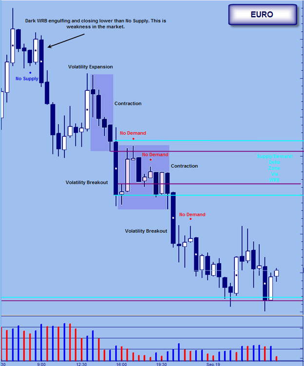
I was going to do a detailed analysis of this chart, but in truth everything is on the chart itself.
Actually, I will add a couple things. The trade here is a short from the No Demand. This is ideal trade based on the weakness in the background. This weakness comes in the form of the Squat bar (which is also within the body of a WRB) and the high volume down candle (the WRB). Prior to that down candle we see an end of a rising market.
-
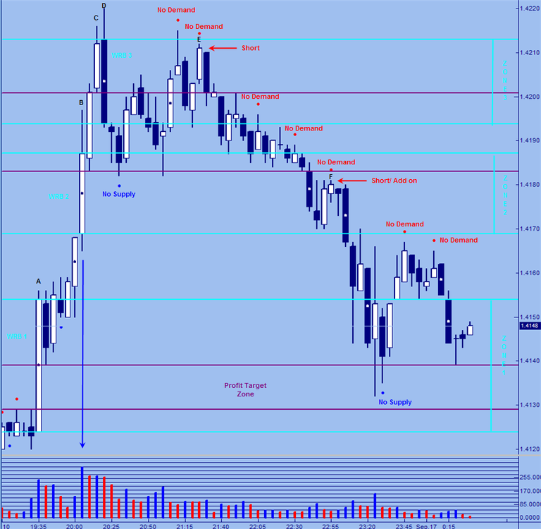
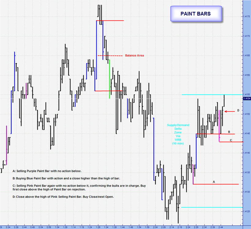
candle wisperer, maybe is a dumb question but how you set the 3 zones particuarly the third oneThe zones, which are simply called zones 1, 2, or 3 on the chart are in fact Supply/Demand Delta Zones created by WRBs.
As to what WRBs to use, I have mentioned some of the things I look for:
1. As a VSAer, High Volume of course.
2. Relatively Large WRBs (if the most recent WRB is larger than any other WRB on your chart, it may be significant).
3. WRBs related to news events. VSA teaches us that the BBs use news events to manipulate the market and establish their positions.
4. Gap Sandwiches (see WRB thread)
5. Volatility
There is something else going on with respect to what makes a WRB significant and thus creates the type of support/resistance zone I am interested in.
From a VSA perspective, numbers 1,2,and 3 are what you should be focusing on.
-
First off, people use VSA in different ways.
The first thing I noticed was that the winners (short trades) are signaled within the body of WRBs.

As for the chart I have marked up here, there is a major sign of weakness on that dark hammer candle. In VSA parlance, it is an Up Thrust.
Quit frankly, the two charts you have hear show some good trades. Although I do not know how long you held the positions and where stops were placed. I would argue that the first thing you are doing correctly has to do with the WRBs even if you do not know what a WRB is.
Anyway, I hope this helps and I hope more VSAers will leave some input.

-
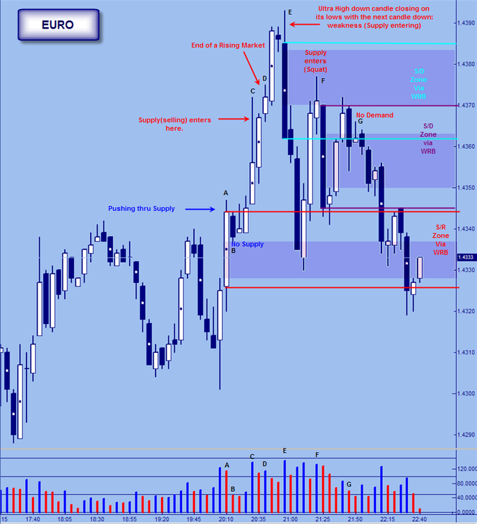
This chart is a bit busy, but I hope you take the time to see what is being put forth.
First, I really don't like profit targets. I would rather let the market take me out. For those who do, Supply/Demand Delta Zones created by WRBs not only make ideal trade entry points, but also possible price/profit targets.
Let's start at the beginning.
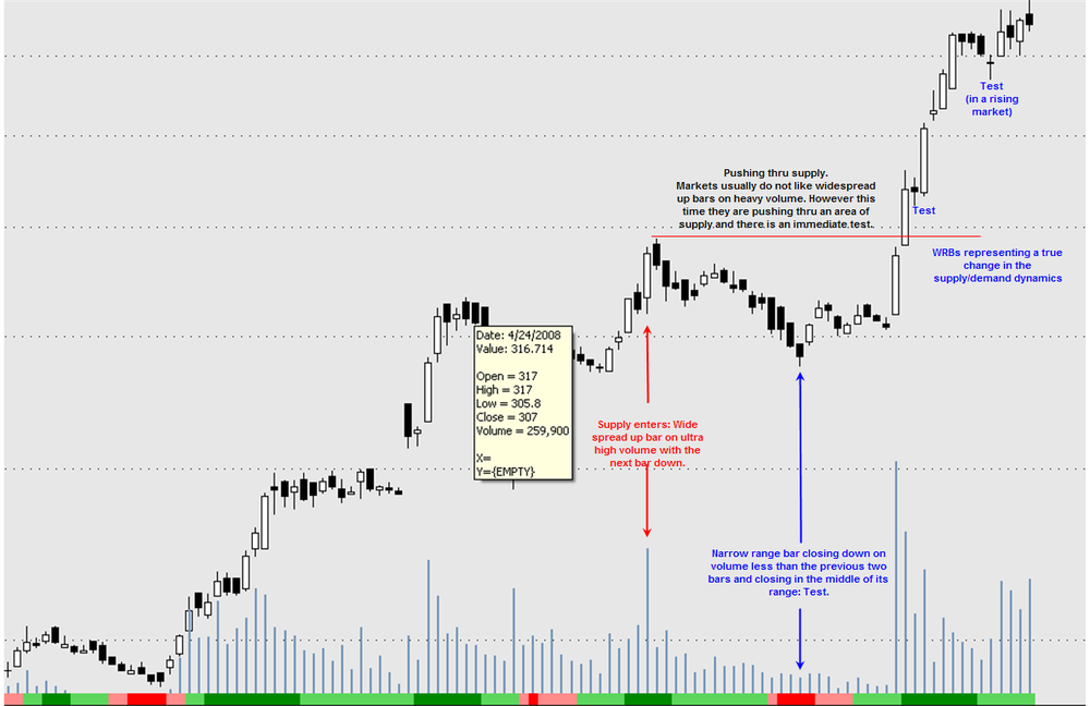
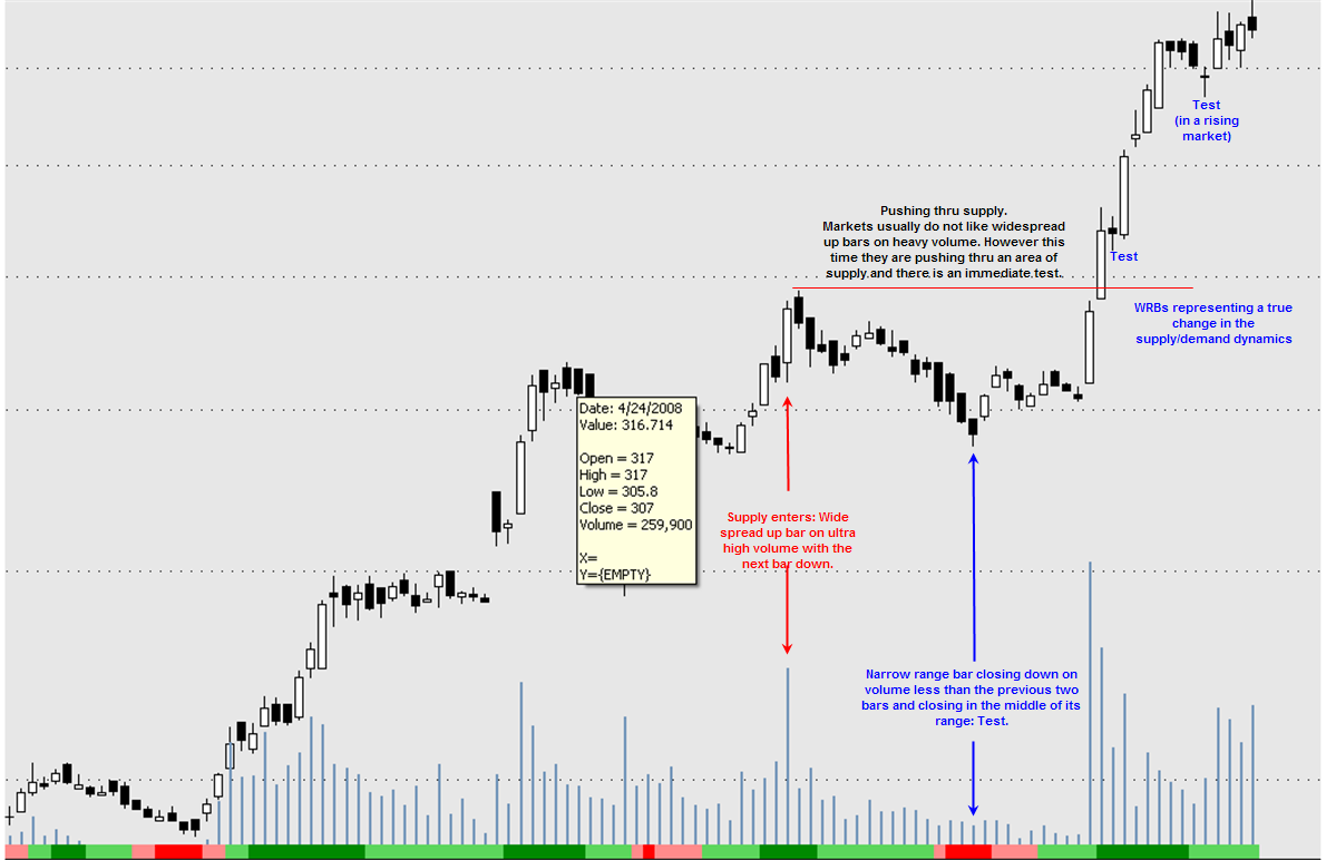
A: We see a large white WRB with volume that is high. What cannot be seen is the tops to the left. In other words, while markets don't like wide spread up candles on high volume, this is pushing thru supply and thus bullish. We now have our first WRB Zone (Zone 1). Our first intent is to take a trade if price falls within this area. There is a No Supply and some would enter long here. However, this candle is not fully within the zone, so we do not.
B: Another wide spread up candle, this time on even heavier volume. Note that the close is off the high. Some supply (selling) entered on this bar. Why else would the volume be so high and the close off the top of the range? WRB Zone 2 is also created. The next candle is up but the range narrows and volume falls slightly.
C: Now we see an even narrower candle on increased volume. The Narrow range is a clue that something is changing. With all that volume, why is the range relatively small? VSA says the range is being kept small because those that can see both sides of the market, see all the sell orders form the BBs and thus expect prices to fall. If they were bullish, they would want to charge higher and higher prices to enter as they would be expecting price rises.
D: Wide spread down candle on good volume. We make a higher high, but close down from previous bar. Also note that this candle engulfs previous narrow candle. A shift is underway. This gives us Supply/Demand Delta Zone 3 on the chart.
E: Before talking about E, take a quick look at the No Supply. Notice that this is not within the body of a WRB and thus not a signal. It is true that price moves up from this point, however. Also the first No Demand is an Up thrust in the form of No Demand.
E is No Demand within the body of the Dark WRB. We have weakness in the background so this looks like a good place to go short. At this point, we can expect that price may fall down into the area of the first WRB or Zone 1.
F: Another No Demand sign within the body of a WRB. At this time, we also have just had a No Demand within the range of a Long Shadow on the 30 min. Just more evidence that the market is weak. This is another entry point/ add-on if already in.
From here price does indeed move down to the profit target area. So we can see that the Supply/Demand Delta Zone can play more than one role- 1. an area to look for signs of strength and weakness and 2. profit target areas.
On the other hand, notice that one could simply move a trailing stop down on the appearance of each successive No Demand candles.
-
Eiger,
Two questions:
1. Does the fact that the last bar makes a lower low and not a higher high casuse you any concern?
2. That's alot of volume there for an up bar. When you say off, you mean the data? Suppose the volume is correct, is that still a potential spring? With so much volume we really need to see what happens on the next bar.
-
What happend.
-
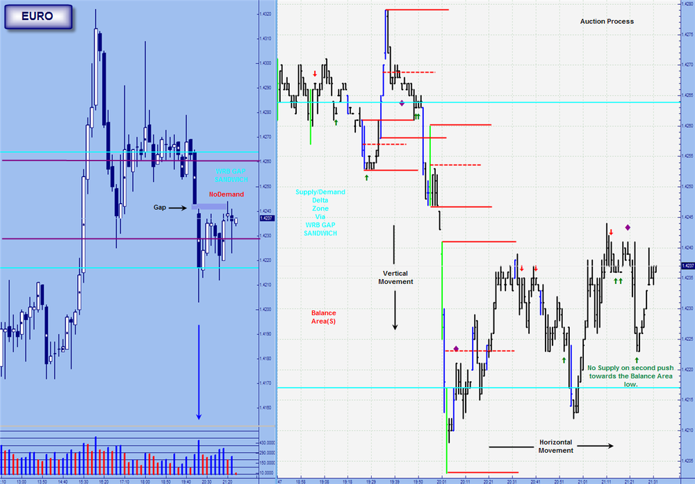
Example of a "WRB Gap Sandwich":
Just wanted to show a WRB Gap Sandwich that creates the Supply/Demand Delta Zone. The pattern is simple: two WRBs with an actual price gap (hint) in between. Once we see the interval after the second WRB, we know if we do indeed have a Gap Sandwich.
Price moves down and on the second WRB we get a wide spread candle closing off its lows on very high volume with the next bar up. Demand must have entered on that candle.
The really interesting things, however, take place on the 1 min. First, notice the vertical movement involved in creating the Gap Sandwich. In Market Profile terms this vertical movement means the market is unbalanced. As it streaks down, it creates a few Balance Areas. The key one being the last one. Not because it is the last one so much as because of its relative size. A Balance Area of this size tends to lead to Horizontal movement or consolidation. Or in Profile terms a balanced market (hence the name Balance Zone).
If one was to take an actual Market Profile chart, one would notice that after periods of vertical movement, there are periods of horizontal movement. In fact, if one collapses the data one would find that as the period of consolidation (horizontal movement) more approximate a bell shape cure, the more likely it is to be ready to enter another vertical phase. That is what the 1 min chart is showing.
Anyway, back on the 10 min chart. Notice that the candle that fills the actual price Gap is also a narrow candle closing up and closing off its highs on volume less than the previous two bars. Simply, it is no demand.
But look what happens on the 1. Price moves down and makes a higher low within the Supply/Demand Delta Zone and we get a No Supply. This market is poised to go up, not down. We can get long with a "price target" of the upper level of the Delta Zone.
-
Great post CW. Can you explain the significance of the body of the wide-range candle and what makes it such a potetnially important location? VSA talks about coming back into the area of high activity (the wide range bar in general) and testing the high volume, but it doesn't say much more about it. Is there anything that can be added from candelstick theory?Thanks.
Eiger
Eiger;
Just a few things:
1. The Body is defined as the area from the open to the close. Thus there are WRBs on bar charts. Simply, the concept is not exclusive to candle charts.
2. Tom Williams does not look at the open. Yet if one includes the open one can narrow down the Supply/Demand Delta Zone from the range of a widespread bar to the WRB (open to close range). Tom doesn't like the open because he says it can be highly manipulated. However, it is still the first balance point. That is the level where there is agreement on price but disagreement on value. More exactly, it is the first such point since the last close (which is of course the final balance point for any period). And we are not interested in the open versus the previous close, but the open versus the close on the same period. Thus, even if the open was manipulated higher from the previous period, it is where that open is in relation to the close.
3. Mark is the true WRB expert and I can not say too much about them in terms of what makes one more significant than another. However, we know that VSA is looking for high volume bars and we know the role VSA says news events play in BB manipulation. While Mark has mentioned this both here and at Elitetrader.com, I will not use the three letter term. But I did say in the previous post we need to wait for the period after the WRB to know if it is a significant WRB......
-
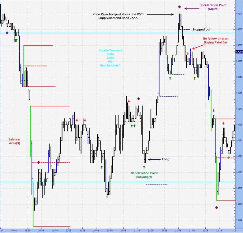
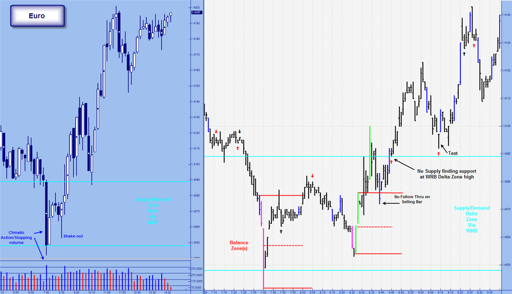
High Volume Bars: stopping volume/climatic action
First, everyone should read the prior post by Eiger. He is spot on.
This post is about examining the transitioning of the supply/demand dynamics within the body of a WRB created on high volume. I wanted a way to "See" the dynamics change within the all important Supply/Demand Delta Zone. Moreover if the WRB Zone is in fact a place of change, I figured it could be seen by looking at what the Auction process is doing in this area or zone.
This is a VSA thread so let's keep the main focus there. Take a look at the 10 min candle chart. We see a WideSpread down candle on ultra high volume with the next bar up. Demand must of entered on this candle, otherwise the next bar would not be up. As it happens this candle is also a WRB. The body of this WRB may become a transition area. Once we see the next candle, we know we have a valid WRB supply/demand delta zone. Three candles later, we get a narrow down candle with volume less than the previous two candles. This is no supply. The very next bar is a Shake Out. This is a very strong bar. Even though it is an up bar on very high volume. Why, well for one thing we have strength in the background
 .
.The telling thing for me happens on the one minute chart. IMHO, one can see the auction market process taking place as the market transitions from one dominated by sellers (supply) to one dominated by buyers (demand). The first Balance Zone is created by sellers as the high is made before the low. However, there are reasons to believe a reversal is more likely than continuation. I do not want to get into that as this is a VSA thread. But what is interesting is the next Balance Zone is made by buyers as the low is made before the high. Move to the head of the class if you see that this Balance Zone is part of the Shake Out candle on the 10 min.
Normally we expect that once a Balance Zone is created that price will trade down to at least the midpoint of the zone and usually test the opposite high/low of the zone. Note that with the buying Balance Zone price doesn't make to the midpoint (red dashed line). Also note the blue selling paint bar that has no follow thru. That is price is rejected at that level and we now can definitively conclude that the bulls are in charge and there has been a shift in the supply/demand dynamic. Interestingly, this entire process takes place within the body of a WRB. Although the bar that completes the first Balance Zone is a bit lower (this would be the wick of that WRB candle).
Also check out that we get a NoSupply bar that is supported by the high of the WRB zone and immediately following a blue buying paint bar. Note how that bar closes near its high, has an open near its low, and has a midpoint greater than or equal to the high of the previous bar. It's a climber.
In sum, once we see the valid WRB we can start looking for certain VSA signals within the body of that WRB. More broadly, we see that strength does indeed come in on down bars. Especially on down bars with very high to ultra high volume.
-
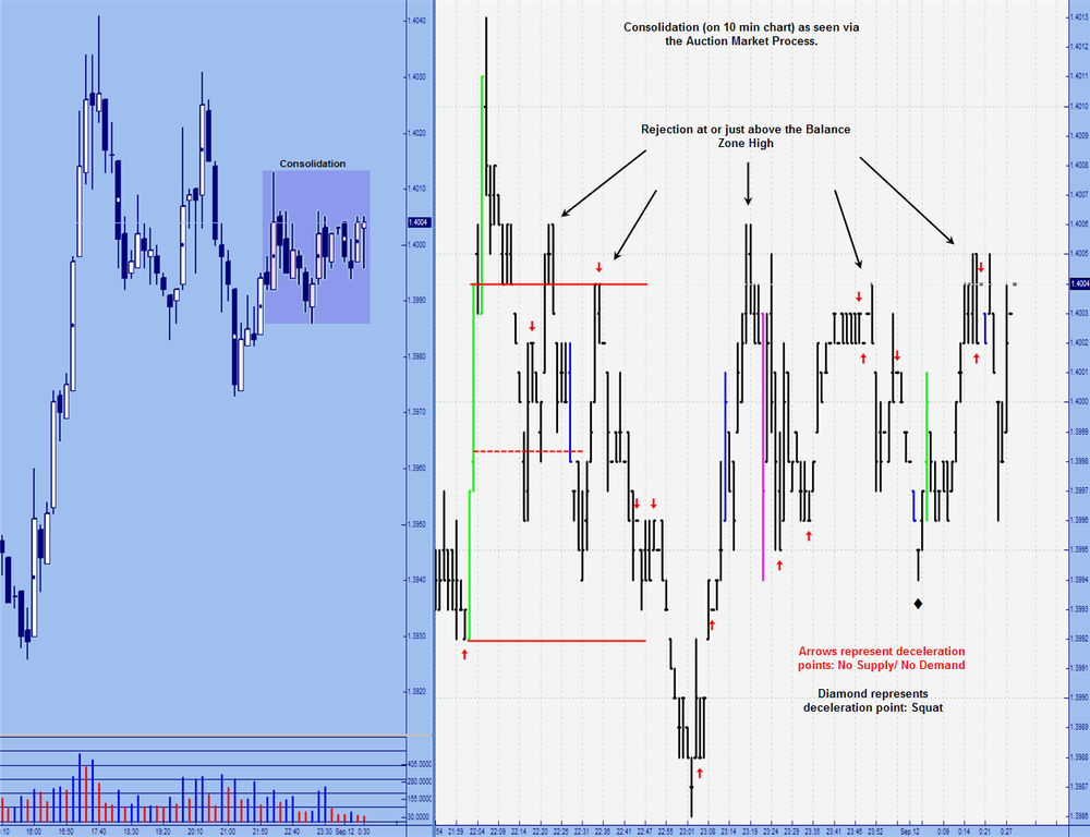
I didn't really know where to post this, but I am interested in the Auction Market Process.
First, this is really a tapestry of ideas if you will. The underlying goal, or thread weaved through out is Price discovery/ The Duel Auction Market. I believe that WRBs are areas of change in the market. As I stated in the WRB thread, I see them as Supply(sellers)/Demand(buyers) Delta zones. Of course not all WRBs are created equal. But that is for another post in another place. The Idea of a zone where changes in the supply/demand dynamic are taking place lead me to want to "drill" down and see the interaction between market participants. That is to say, to view the Duel Auction as it takes place.
The first chart shows that "drilling down". This is a 1 minute chart showing the market going from one that is dominated by sellers to one that is dominated by buyers. After all, At it's base level, a market moves up to find sellers and down to find buyers. As Bill Williams puts it, a markets sole purpose is to find that place where there is a disagreement on value but an agreement on price. This is why a market can not be oversold or overbought. There is always someone on the other side and price by definition is an equilibrium. Although constantly in flux.
Anyway, this set up happens within the range of a significant WRB from a 10 min chart. A selling bar is created at point A but there is no follow through. The Market turns up and we see a buying bar (higher high than the previous bar but not a lower low) that does have follow through. Note the open and the close of the bar. The buyers were in charge the through out that period. We open in the lower third and close in the upper third: a climber.
The Sellers make one more attempt to take the market down at point C. Again, there is no follow through. Notice that the market was heading down but now the sellers don't have the steam they once did: something has changed. Interestingly, we are in area of likely change (body of a WRB__).
The second chart has no trade set up but what I like about it is how it shows the tug of war between buyers and sellers. From a MP point of view, we go from vertical (trend) to horizontal movement (consolidation). Or out of balance into balance. Two consecutive lime paint bars create a large Balance area. I think on can actually see the bulls and the bears fighting it out. We have price rejections at the high of the balance areas, No demand bars, No supply bars, Squats, Climbers, Drifters, Market facilitation increasing (paint bars). I am I kidding myself here?
-
Hi Winnie,Nice to see you back
Springs vs Tests
Springs are not really a VSA term, but come from Wyckoff. Bob Evans, the director of the Wyckoff Stock Market Institute during the 1940s-1960s, created the concept of the Spring. It is one of my favorite trades when it sets up properly, which i will talk about. My trading mentor also loved Springs and always said, "You could make a good living just trading Springs." In many ways, it is like the reverse of the Up Thrust.
A Spring dips under the low of the last low and closes back above the low, either on the intial dip or within a bar or two after that. You should see the market rally away from the danger point (the lows) soon thereafter. Although many Springs are tested, some rally immediately. Like the reverse of an UpThrust, Springs both test the supply under the lows and clear the stops of weak longs.
A Test is a dip back into an area of high volume showing supply has dried up and the path is clear for a rally of some degree.
------
The attached chart is the 5-min ES and shows: a Spring, the test of the Spring, and a couple of Tests (not too shabby, eh?
)The market prior to A is in a downtrend.
A - At A we see climactic action. Volume expands markedly and suddenly. Price has accelerated, and at bar A, the close is above the middle. Next bar is up.
B - The Spring. Price dips under the low at A and then closes above that low. Next bar is up. Note that the volume is less on the Spring (at B) than at A.
You want to see lower volume on the Spring. The lower the volume, the stronger the Spring and the greater the odds that it will rally immediately. On this Spring, however, volume is still a bit high (above average) indicating some supply remaining at this level. This Spring also has a fairly wide spread, indicating activity.
C-D - Because of the above average volume on the Spring, the market tests the Spring. The small reaction from C-D shows narrower spreads (compared to those at A & B) and much less volume, i.e., volume does not expand much as the market moves lower. The bar at D is a Hidden Test (it dips under the low of the last bars in the reaction and closes above and near its high).
E - Just to make absolutely certain, the market makes a Test at E. Tests are always down bars (best when they close mid-range or better) and have low volume. Note the volume at E is less than average. E has dipped back into the high volume area at A & B and shows no supply left on the mark-down. The market immediately rallies vigorously.
As a general rule-of-thumb, tests are considered to have significantly low volume when the volume on the test bar is less than the previous two bars, as it is here at E.
F - Another Test occurs at F. This is classified as a Test in a Rising Market, but has the essential characterisitics of a Test: down bar, narrower spread (compared to the bars on the rally from E), and volume less than the previous two bars indicating no supply is coming in (as the market runs into the small congestion area to the left). In this Test, the close is a little above mid-range, as well. The next bar is up
Keep in mind that Springs, like Tests, should be considered only when there is strength in the background. Here, we had the strength of the Selling Climax. Another clue that this Spring would turn the market was the length of the rally between A & B. I often look for the longest and/or largest rally in the downtrend to indicate the end of the downtrend. Wyckoff noted this characteristic as a sign of strength in his tape reading course.
----
So, on one chart we have the stopping action of a Selling Climax, a Spring to clear stops and test for supply below the low of the SC, a test of the Spring because volume was a bit high (so there was some remaining supply found), a Test, and a Test in a Rising market.
Hope you find this useful.
Eiger
Thanks Eiger. I really respect your work and am greatfull for the time you take with your posts. I, like everyone else, am learning a great deal from you. In that spirit of educational growth, I must disagree on one of the bars.
The only test is see is F. Beautiful example of a test in a rising market. Narrow range closing down and in the middle of its range on volume less than the previous two bars. The next bar is up on higher volume but is pushing thru that small top on the left.
E: the problem here is the close. It closes on its low. Hence we have a narrow range bar that closes down from the previous bar on volume less than the previous two bars but closes on its low. This is no supply/no selling pressure. Of note this bar occurs within the area of the high volume climatic action bar (Long Shadow) and remains an ideal place for first entry.
Again, this is in no way a criticism.
-
I would like to ask you what kind of volume do you think it is good for a test. If volume is so big (bigger than average ?) , you will say there is still supply in it. Do you mean you need a very low volume (lower then average ?) ? How do you distinguish between a spring and a test ? They both seem to be a hammer pattern in candlestick chart.Thanks
Hi winnie. As far as distinguishing a spring(Wyckoff) from a test(VSA), both of us need to hear from a Wyckoff expert. From a VSA perspective there are no springs. It does appear that they are pretty much the same thing, however.
Be careful about thinking of the test as a hammer line. While it is true that the best test bars appear as hammers, or dojis where the open and close are on the top of the candle, VSA doesn't actually look at the open of the interval. Therefore, there is no way to tell if you have a hammer or a doji or any other candle line. Simply put, Tom would be looking at bar charts without the open included in the interval. Hence you would have only close and high-low range. As such one could not tell if there is a hammer or even a WRB for that matter.
With respect to volume, there are two ways that volume is interpreted: relative and absolute. We would like the volume on a test to be relatively low. That would mean less than the previous two bars. We can call that volume low as it low relative to the two previous volume bars. We can also stretch that out. For example, if there is a candle with a volume bar that is larger than any other volume bar you can see on the chart, then it would be considered very high to ultra high volume on a relative basis.
The second way is absolute. While we don't actually need to know the exact number, we can look at an individual bar and determine if it is a lot of volume based solely on the height, or lack thereof, of the volume bar itself. This idea is a bit easier to see through the way TG has their volume tool. As the volume bar moves into certain color levels, the volume becomes greater and greater on an absolute basis.
Hope that helps. Thanks for the question. This was the point of the post: various volume levels on tests candles and how markets react to them. One test bar was relatively low, but high on an absolute basis. One was not low on a relative basis, but lower in absolute terms. And one was neither low on a relative basis nor on an absolute one.
-
Very interesting stuff here.
There is some pretty advanced stuff going on in this chart. Actually, advanced might not be the correct word. I think subtle is more appropriate.
I did not label the various candles but I will be starting on the left and moving right.
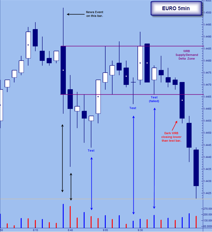
(1) The first candle is very important to VSA. VSA states that the BB will use news events to manipulate the market. This candle was created @ 0835 on Thursday. That means it started at 0830 and ended @0835. There was a news release @0830. Thus this is the bar created on the release of the news. Notice the Ultra High volume. We have a wide spread down bar on ultra high volume that closes off its lows. If all the volume represented selling, then the candle should not close off its lows. There must be some buying going on in there.
Of course, we need to mention that this candle is a WRB. Thus this candle sets up the Supply/Demand Delta (change) Zone. As I have said many times, this area is the optimal location to target trade entries. More broadly, it is the optimal location to see changes in the underlying supply/demand dynamics in the market. We keep that in mind as we move forward.
(2) Things start to get tricky. This bar closes down from the previous bar. As we have determined that there was some buying on the previous candle, we would expect this candle to close up. But wait, it is not that simple. This candle forms a Long Shadow. From a VSA perspective, the candle is wide spread closing in the upper portion of its range on very high volume. Although less than the news candle previous. Simply, there must of been buying on this candle as well. If there was more selling then the close should be lower. Note that the next candle does close up.
The next candles I want to talk about are really the reason for the post.
(3) Having seen buying on the first candle and buying on the second candle, we now see a candle that makes a lower low and closes on its high. This candle is trading into the High volume area created by the second candle. The long shadow area to be exact. But we must ask ourselves, "what is going on with the volume?". Note that it is less than the previous candle but it is not all that low.
"All testing (down during the day to close on the highs, on low volume) is usually a sign of strength. If the volume is not low, then it shows us that there is usually some selling(supply) present. Rarely will a market go far with supply in the background [b/]...." Master the Markets,Tom Williams, P. 158
So the market may rise but the rise should be short-lived if the test was on high volume. This was high volume.
(4) Price does move up a bit. Notice that price is moving into the WRB Supply/Demand Delta Zone. Now we get another candle where price moves down then closes near its high. Of note is that the move down, takes price out of this zone and thus disqualifies it as a signal candle for me. That point not withstanding, check out the volume. It is lower than the volume on the first test candle, but higher than the volume on the previous bar. Still not a good sign for a test bar.
(5) This is the key test candle. As we would expect, the candle makes a lower low than the previous candle and then closes near its high with a narrower range than the previous candle as well. We are in the "right" location. That is, the entire candle is within the body of our significant WRB. But look at the volume. It is less than the previous two candles, but very high. In fact, off the tree tests, this one has the most volume.
"Generally, a potential failed test will be accompanied by high volume, which indicates that supply is still present..." Master the Markets, Tom Williams,P. 158
Simply, the market is testing for residual supply and finding it. Notice that the next three candles do not close higher than the close of the test candle.
(6) All bets are off. With the appearance of a Dark WRB that closes below the last test candle, we know the market is weak. Actually, the high volume test candle within the Supply/Demand Delta Zone told us the market was weak. This WRB only confirms it.
-
Hi,I am just a noob in VSA. I am very interested in learning vsa. But before I dive in I want to know if it applies to the eod data of the market I trade in. Below is the chart of a stock I know for a FACT that has been manipulated. But can vsa be used in this case to explain? all the vsa experts on the forum here, can you guys SEE the trends/rally's before they take place?
Just a few things I see.
VSA does make the case that markets (and individual stocks) are manipulated. However, if you feel this is a highly manipulated issue (with an extremely small float) you might do better to stay away. And if you know for a fact that there is insider trading then stay away.
With that said VSA can be used on any freely traded instrument......
-
TAWE;
Interesting. These two charts bring up a major sticking point for some: patience.
If you have heard Todd speak, he says a "test" bar is NOT an actual test bar unless or until one of the next two bars closes up and higher than the close of the possible test bar. In other words, at the time you took the trade the bar was only a possible test. Two bars later (30 mins) we still see no successful confirmation of the test. To be sure this is a failed test and signifies weakness rather than strength. A lot of people do not like waiting for confirmation, but do wait for the close of the bar itself. Thus, I would say that you were to early because you do need to wait for the bar to close.
Let's back up to the first bar (white arrow). We have high volume on a wide spread down bar that closes off the low with the next bar up. As you stated, demand must of entered here (strength). VSA 101: strength enters on down bars and weakness enters on up bars. But take a look at the next bar. It does indeed close up, but it fails to make a higher high. It also has a narrow range and decreasing volume. Not a very strong bar. There is pressure keeping the range small and the change minimal: supply. Hence the market tests to see if that is indeed the case.
If you look at the first bar after the possible test bar, you see a bar that makes a higher high on higher volume, closes lower than the previous bar and closes near its lows. This is an Upthrust. It is also a form of squat as we have higher volume on an equal range bar. (I am just "eyeballing it so I could be wrong on that). Now we are three bars after our high volume down bar and price has gone nowhere but sideways. The demand that entered is being swamped by supply. This market is weak.... The very next bar closes below the low of the test bar. Failed test. Sign to get short.
This is after the fact, but I hope it helps. For what it is worth, my main recommendation is that you need to wait for the current bar to close before taking action, or at least drill down to a lower timeframe and trade on the close of that interval's bar.
-
Trend Day Down again today. When we get used to countertrend trading and fades, it can sometimes be challenging to shift to a trend day mode. The background, early indications after the open, and a series of VSA indications gives us a nice structure and methodology to stay on the right side of the market.We were already in a down trend (see 60-min chart) with no indication of demand on the higher time frames. The market opened below yesterday's low and gave clear indication it was having difficulty rallying much above it during the fist 45 minutes after the open..
5-minute ES:
A - An Up Thrust into the conjestion area just above yesterday's low. Note the inability to rally over the first 45 minutes.
B - Volume picks up substantially at over 94,000 shares. This is quite a bit of voleume on a 5-minute bar. Is it stopping volume? It can be, but look at the 60-minute chart. There is a good support area along the 1260-63 line. The heavy volume we see on the 5-minute chart is the result of professionals pushing through that support coupled with trapped longs bailing on their trades and break-out traders adding to the liquidation.
Although we see some Shortening Of the Thrust after bar B, closes are on the lows and new lows are made - hardly bullish behavior. (You can compare the market behavior following B with that following the other sudden high volume bars on this chart. Even though we are in a downtrend, the subtle signs that the market would attempt a rally or rest after D and H were there. Of course, a better comparison can be made with sudden high volume that turns the market on other days).
With a break of significant support on heavy volume and a downtrend already in place, the odds were good for continuation to the downside.
C - An up bar, on narrow spread, volume less than the previous two bars after a series of lower lows and lower highs -- a lovely No Demand. Next bar is down (Up Thrust).
T - Appears to be a test - but there is no strength in the background, only significant weakness.
D - High volume down bar on wide spread, next bar is up and this knocks the market sideways, Note the inability to rally. There is no demand for the upside going into the noon hour. An UpThrust at E caps the rally. Next bar is down. The small rally that follows E is on low volume and shows no demand.
F - Although the volume had dropped off over the noon hour, you can still see that up bars were No Demand or on very low volume as the market drifts lower.
G - Even over the lunch hour when volume is low, the market shows an increase in volume as it breaks the old low at D, signifying further weakness. The No Demand that follows confirms.
H - As usual, a sudden increase in volume turns the market and we have the longest rally of the day. It lasts a little over an hour and struggles to reach the high of the sideways movement/very weak rally at 2:00. The market finishes this rally with an Up Thrust at I, next bar is down, followed by a further reaction to close on its lows.
Eiger
Have not posted in a while. Eiger you have done some nice work. Thank you. There is much we all can learn from you. The openness and the quality of insight is what makes this place different. The quality of traders like you, make this place different.
With that said, I do want to call into question a couple of things:
T: is not a test. Tests (ideally) close in the middle or high of the bar and usually make a lower low. This bar closes near its lows and neither makes a higher high or lower low. Simply, this is an "inside" bar on low volume not of particular note in VSA.
Actually, that's the only thing. Everything else is spot on imho.
Where would you have entered the market initially? What about add-ons?
-
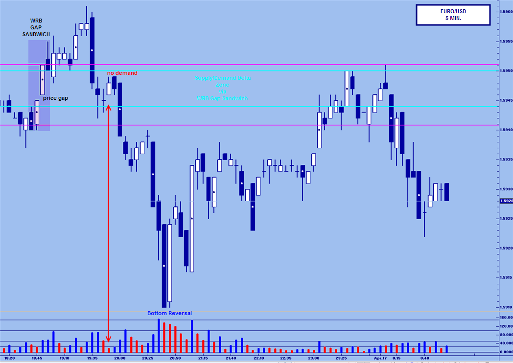
Been wanting to post this for awhile now.
As far as WRB patterns go, I really like the volatility breakout pattern. Another pattern I like is one I have "discovered" on my own. At least as far as I know, I did.
I call this the WRB Gap Sandwich. Basically, we need a WRB (white or dark) followed by an actual price gap (hint) and then another WRB. We also need to look at the candle prior to the first WRB and the one after the second WRB. This price action creates the Supply/Demand Delta zone.
In the chart below, the left side shows the WRB Gap Sandwich followed by a no demand within the key area. Short signal generated. Traditional gaps are important and represent changes in supply/demand. This is doublely so with the appearance of the two WRBs.
The second thing to note is the bottom reversal. The first bar happens to be a WRB, but that is not important for this post. What is important, is once we get to this point our entry signal zone created by the WRB Gap Sandwich is now a good profit target zone.

-
......................Tawe really I don't think it wise to wait for confirmation, the no demand is usually very narrow, very low volume (by definition) quite often an inside bar (not VSA I Know). The next bar is often a 'thrust' as it breaks out. i.e it is wide it opens one end closes the other. Actually seems that a fair few of the WRB type guys are looking to exit right around there. If you wait for that bar you are going to get poorer trade location. Watching live on 'smallish' intraday timeframes you can see volume dry right up and price just hang there before it cracks. Each to there own of course...Nice BlowFish, very perceptive observation. I have noticed recently a fair amount of White WRBs following test bas (candles). And while no price is too high to buy or too low to sell, it does almost feel like one would be chasing to enter at that point. Despite the fact that the WRB closing higher is confirming the test.
This is why I like to emphasize the Supply/Demand Delta (change) zone. To me it is sort of the confirmation before hand. Actually I think that was a pretty darn good trade set-up. I just don't like the fact that it adds fuel to the hater's fire.


ES Limit Up?
in Futures
Posted
You are making an error that they want you to make. A Day trade is by definition a trade that is entered and exited on the same day. Therefore if you enter a trade in the morning and are flat by the close you have made a day trade. If you make a day trade you are a day trader. How big your account is has nothing to do with it. Simply, there are many well funded institutions that make day trades and thus are day traders.
Most Mutual funds are not day traders they are investors (holding periods of months if not years). As such they tend to be LONG ONLY. The unsophisticated public mostly places money here. And because this they don't understand that money can be made when the market falls as well as when it rises. Nobody called the last two days PANIC BUYING......