
Welcome to the new Traders Laboratory! Please bear with us as we finish the migration over the next few days. If you find any issues, want to leave feedback, get in touch with us, or offer suggestions please post to the Support forum here.


motorway
-
Content Count
48 -
Joined
-
Last visited
Posts posted by motorway
-
-
A proper P&F chart .. catches all the changes of the "Market Price"
So what is the Market Price ?
It is not the movement from Bid to Ask and Back.
That is the necessary Bid Ask Bounce Through the Market Price
A chart catching the BID ASK Bounce is a valid chart.
But not under the proper definition of a P&F chart which always removes Fluctuations that are not of the Market Price.
Such a chart looks like a P&F chart but is better called a Tape Reading Chart.
It will have extensive sideways movement ( sometimes you need to use with very low priced stocks )
Your aim is to pick up the flow of information and recognize
Esp Asymmetrical Information ..
That changes the "Market Price"
This does exist at the BID Ask Bounce BUT along with a lot of noise
A proper P&F chart will filter out the necessary Bouncing through the changes of the Market Price (The market price of interest to YOU.)
A good start is to use 2x the Bid Ask Spread, 5x and 10x ( then 20 , 50 , 100 etc )
Then examine the chart to see if it achieving its and your purpose.
When you double the box Size
everything will change detail by on average a factor of 4 ( 2^2)
Time Volume Fluctuations etc ( THAT ARE FILLING YOU BOXES )
Everything ! ( except for the non random aspects )
( it is interesting to keep say these three charts and note divergence )
This is with One Box reversal charts. which is where you should scale your chart from.
then use the three box reversal with each of the Box sizes in coordination )
EG So you decide to use 5X the spread
So your charts are a 5 X 1 , 5 x 3
and if you then want the 10 x 1 , 10 X 3 etc
Time and Volume will look after themselves
Both will scale with resolution
So do not scale your chart with Time or Volume (IMO)
Scale it with size of moves and the structure of the chart .. ( Hint -->The ratio of Horizontal to vertical)
Then you can add and work with Time and Volume ( recommended esp Time )
to the extent you want..
You will only learn by doing
and a lot of theoretical things will then make sense.
P&F and Tape Reading Charts have a long history
With High Priced Stocks etc
some thought can be given to using LOG charts
defining the Bid Ask in multiples of %
( But no good at all for low priced securities which need a stepped Scale )
Motorway
-
Time is Important
time Frame is not important
Time as in Duration is VERY IMPORTANT
a P&F chart has an X and Y axis
a Bar chart has ALSO an X and Y axis
Both charts move through Time. But differently !
As I said I think Time is very important..
Motorway
-
Something to think about for those who do chose to explore
market reality from the perspective of P&F
From Peter J Steidlmayer
Modern day reinventor(?) of P&F
COMPARE to ALEXANDER WHEELAN very dense but very good little text on P&F !
Organizing data is always the first step in analysis. Most technical traders organize market data in terms of time and price. Peter contends that this is not the way the market represents itself, and that traders would be better served to view market data as the market actually presents it.Peter examines market segments, or discrete market movements, in terms of value and development rather than price and time. To really understand the market, traders must allow the market to communicate freely. Any externally imposed structure will distort the results. Peter views chronological time as just such an external structure. Market movements do not conveniently begin and end at pre-calculated times in order to coincide with a particular chart or trading style. Market movements begin when some inefficiency between buyers and sellers exists. The movement ends when the market has attained its objective. Most technical analysis is based on the premise that the current price has already discounted all available information about the underlying instrument and so is “fair” at any given time.
Peter explains why recent developments in the markets invalidate this assumption — price at any given moment no longer represents value at that moment. Inefficiency generates market movement. In Peter’s terms, such movement begins with a dominant force that then drives the movement to some result or output (price). The end of any given market segment is, by definition, the beginning of another. Determining how, when, and under what circumstances a market segment ends is the beginning of market evaluation.
The concept of efficiency is critical to Peter’s methodology. It is, essentially, that state in which the buyers and sellers agree on the value of an underlying instrument. Peter explains the concept of dynamic efficiency, in which the markets are always moving from imbalance to balance. Peter believes that, ultimately, questions raised by the market can only be answered through active participation in the markets.
According to Peter, the market “ . . has a well-defined underlying process that can be understood and recognized and that process has a natural progression that can be seen and measured. It has reference points which, when identified, represent important information, and it produces a final output which accomplishes the market’s purpose. The process is cyclical: it reaches closure and and then starts over again.”
Very Good BUT
What He calls Value is from a P&F view really a Difference of Opinion .
Consider EVERY BOX on a P&F chart = A difference of Opinion.
A trend is sequentially Higher or Lower -->
Zones of DIFFERENCES OF OPINION !
consider carefully
Unless You Understand Time
You Understand NOTHING.
Motorway
-
Do not look at the charts as just a form of breakout method.
Look at it in the same terms as market profile.
Look at The Horizontal Formations especially..
Your charts will seem to adapt to market time.
But they are not adapting .. They are market time.
Do not focus just on the static aspects of the chart
But the changes in activity as well.
Watching the chart FLOW and Build structure is the best teacher.
Motorway
-
Try box size .5 and reversal size 1
As alternate ( depending on your software )
You could try BOX size .25 and reversal 2
Try also Box Size 1 X Reversal 1 (alternate Box size .5 X Reversal 2 )
Should give you nice charts.
.25 being the min increment on the instrument.
Motorway
-
The only close that has a higher relative importance is the close of a day.
Because it forces those working on very small time Horizons to close positions.
Multiples of this Day .. week month YEAR will have also a (less) relative importance.
Divisions will have even less relative importance ( but yes, some )
Still all these even are of only relative importance.
What has an absolute importance.. IS not the close of a time frame.
But the end of a Buying or Selling wave..
Something that is very educative is to draw a 1 box reversal P&F chart.
2x 5x or 10x the bid/ask spread ( depending on the price ) . make sure you use the course of trades ( they are the absolute reality ) and not any H/L of a time framed bar.
Then look at what you have drawn
Ask what is it that makes the chart change columns ?
It is not any time frame or the close of any time frame. it is when buyers and sellers become exhausted .
Those tops and bottoms of the alternating columns.
Have an Absolute Reality. They have Absolute Position in Space and Time.
Just like looking at a Mountain from varying distances.
Its top is THE TOP etc
Changing the BOX size is not changing time frame it is just changing the distance you are viewing the absolute reality FROM.
Motorway
-
Motorway,Very well said. I apologize for mis-typing in my earlier post. Price movement is the result, not the effect. You are correct.
Thanks for pointing out my error.
Gary
Gary I knew it was a Typo. You have great knowledge and experience !
Often look in at the LTG Wyckoff Archives .
Always worthwhile.
Great Free Resource for anybody !
Motorway
-
Volume is the effort, price movement is the effect.Gary
Volume is Effort Price movement is RESULT
A certain price movement ( That seen on the Figure Chart )
is a CAUSE that will have an EFFECT.
Without a Cause there is NO EFFECT.
Wyckoff Measures a Cause by the number of swings up and down in a trading range.
Not by the length of time and not by the amount of volume.
( Hence why the Figure chart appears to not use time and volume )
Volume is always qualified by price movement and time.
IF we ask what was that Volume .
Then we look at the Price movement.
Now consider what draws a figure chart ?
Volumes and time do.
TRADES
A Trade is the only way to get a PRICE for the Figure chart to MOVE to.
This is the cause that will have an effect.
Each of these swings Up and Down
naturally had a certain volume and a certain range.
But consider
why does a swing Up end and become a swing down ?
why does a swing down end and become a swing UP ?
Because demand and supply in turn gets exhausted.
And this is what matters==>
REGARDLESS of the VOLUME or the TIME involved.
So what happens with an aggregate of UPs and DOWNs ?
of Buying and Selling Waves ( The count across the rows on the Figure Chart )
One or the Other side is Exhausted to a greater extent.
Floating Supply is reduced and GATHERED TOGETHER in a way that effects future DEMAND and SUPPLY to some extent, to a greater extent.
Again each of these swings Up and Down
naturally had a certain volume and a certain range.
And this is Effort and Result.
All These relate to all the Waves of Buying and Selling.
A Bar chart is just a tool to see these Waves cut up into slices of time ( time framed )
But it is the Waves that are the market reality ( and they last as long as they gather a following ( No Time Frames )
A Figure chart
cuts the waves up into something else instead of slices of time.
Into Discrete units of price movement in their own time.
Demand and Supply
Effort and Result
Cause and Effect
Are properties of the Waves does not matter what chart you are using.
Motorway
-
Thanks Gary. Its good to have a way to guesstimate how far a move will go, but do they give any more information than price charts as an indication of whether the prices will go up or down? So when measuring how far a move will go, will the chart tell which direction the move will go?Wyckoff P&F Does not have time in the sense that a vertical bar chart has time.
That is the waves of buying and selling are not deformed by cutting them up into slices of time.. A Wyckoff P&F chart is made from the full course of sales and reveals the price path THROUGH the Slices of Time that the Vertical Bars are drawn.
A P&F chart IS a PRICE CHART it is a PRICE X PRICE chart. IT is a TWO DIMENSIONAL PRICE CHART moving THROUGH TIME.
A Vertical Bar chart is a price x time chart . It is a One Dimensional Price Chart moving through time.
Of course the P&F chart can reveal more. Wyckoff states this clearly ==>
The figure chart may show many fluctuations on thefull figures, while the verticals are unchanged. For example, if the high full
figure of a stock on a certain day were 45 and the low 40, there might be several fluctuations back and forth between 42 and 43 on the figure chart, but no indication
of this would appear on the vertical chart.
For these reasons it is vital to keep both forms of charts.
To define the trend of the market or a single stock, therefore, both the
figure and the vertical chart should be used.
But you must use the Full Course of SALES and a Suitable BOX size ( NO longer a POINT We do not trade in Eighths anymore but decimals eg a Point was only 8 times the min bid )
The most Important thing to grasp is the Figure Chart is a TWO DIMENSIONAL CHART
in the same way Market Profile is a TWO DIMENSIONAL CHART, But without any deformation with Chronological Time and no collapsing into a Bell Curve.
Practice will soon reveal that in the main --Time and Volume as used in the bar chart can be dispensed with and clarity gained not LOST.
If you are not using the full course of sales this restricts you immensely and is not WYCKOFF P&F.
Motorway
-
Gary,Do the Wyckoff P&F charts show the ebb and flow of supply and demand and give reliable signals on which direction the market will go in the near future?
Also, are P&F charts done with the Wyckoff calculations more reliable than other methods of calculating them?
Ebb and flow of supply and demand is the ONLY thing that makes a P&F chart move.
It is directly drawn by the Composite Man....IN HIS TIME FRAME ( = NO TIME FRAME )
There are sides to Wyckoff.. Eg He used P&F ( with Volume ) for tape reading and short term trading.. He also said that "We would do better " with a figure chart for longer term trading.
=>give reliable signals on which direction the market will go in the near future?
Yes but it is about Wyckoff's Method .. You will increase the reliability by using all factors including the "time element" and Volume..
The figure chart already does include them ( Why RDW could say we will do better )
But to at any point in time .One or other factor eg Volume could be "vital"
Consider that it is Volume that fills a Box ( no trade, no volume, no BOX )
But just like the waves of the Ocean have water in them . It is not the water that makes the Waves.
What defines volume and qualifies is The price Movement ( "A fine pair of scales" ) and Time ( changes in activity.. Speeding up slowing Down )
We should think in terms of waves.
Motorway
-
day trading
futures
Most seem to use
linnsoft
investor/rt
( you can do some neat things with this using volume as well )
course of sale is best
built off one min bars is better than 2 min ;-)
I have many charts from people who send me charts
involving futures
some use BOX size = to the bid increment
But I would start with a larger BOX size
What size ? the BOX sizes that "counting" the chart quantifies...
along with the diagonal lines and open spaces
You have then have an adaptive chart
drawn directly by the Composite Operator
By the Market ..By demand and supply.
No Oblivion or Distraction
NO tIME distortion
Motorway
-
The Book is OK read
But is Not complete as in the title "COMPLETE"
it is basically three box reversal breakout method
What does it lack ( to be Complete ? )
esp ONE box reversal charting
The use of Time ----which is change in activity ( see Alexander Wheelan )
Use of natural trend lines besides the 45 degree lines ( which originate from One BOX Method that is both natural and 45 , Wyckoff used natural)
On Gaps you can use dots instead of X and O where there are no actual trades if you want to.. fell out of use...
http://www.mta.org/eweb/docs/Issues/08%20-%201980%20May.pdf
some info here from page 39
Motorway
-
I only see 13 Boxes
To calculate the price objective on the upside, first add up the number of boxes comprising the
first up move after the bottom = 13
P&F is a REAL TIME CHART
KEY point
changing time frames changes everything
But changing scale in real time . Changes nothing. The events that make up history
stay in proportion...
The Fluctuations = Market Events = Unfolding Probabilities
"The new high on Tuesday is treated like the new-high on Thursday in p&f"
Because the reference point is the fluctuations and they are as they are
When We measure with a ruler and not a clock.
Real Time is something else it is not the tic toc of the clock..
From the Book-->
Why is discretization of price far superior to discretization of time?Discretization means the division into small individual elements. In technical analysis
– other than point-and-figure – the information is sliced into individual elements
according to the time axis. The data or information is partitioned into weeks, days or
multiples of minutes, and hence the horizontal time-axis or time-line is equally spaced.
That is discretization of time.
But does time matter for a long or short position?
No, or only to a minimal extent. In point-and-figure the data is divided according to
price; that is discretization of price. Does price matter? You bet! Point-and-figure has
an advantage over other technical analysis methods through this fundamental
difference in discretization of the information.
Think of it. It does really not matter if the Dow moves to 10,000 over 1 or 4 weeks.
What matters is that it does move to 10,000. Does it matter if your favourite stock
moves to a new high on a Tuesday or a Thursday? In bar-charts, yes, because it alters
trend lines. In p&f it does not, and hence especially avoids fuzziness of such trend
lines.
The new high on Tuesday is treated like the new-high on Thursday in p&f, and
a year with little price move action takes little room on a chart and a year like 1987 or
2001 with a lot of movement takes considerably more room; and that is what we
believe is the correct representation of a market.
Like in a history book where the era
of the Neanderthals should occupy fewer pages than the 20th Century. In the bar-chart
world, the 20th Century would be described in the same number of pages as 100 years
of our ancestors fighting the sabre-tooth tigers and catching mammoths!
This is the start of understanding the why of P&F. Real Time , Broken Time , Market Time
INTRINSIC TIME....
Motorway
-
It is Stock JMAT in LONDON (Johnson Matthey )
It is page 113 an example from
Complete Guide to P&F Charting
Henrich Weber & Kermit Zeig
I only see 13 Boxes in the marked column not 14 as is in the text...
I thought I recognized the format..
The book gives a good simple answer to the WHY of P&F
and what is distorting about time
However it mistakes a trading method with charting method
being just about three box reversal breakouts
Motorway
-
Yes 5 and 10

I get Objective of 560 ?
6 Boxes of 5
Then 7 Boxes of 10
= 100 pts x 3 = 300 add to the low 300 + 260 = 560
Motorway
-
Also the VC column involves two box sizes
.05 and .10
Motorway
-
For some reason the chart defaulted to a earlier date in Dec..
So it needs to be updated
Motorway

-
I define the immediate Trend on any scale
as Two Boxes in the same direction
here is the .025 chart
Trend is down ( as it is on the .1 and .05 chart )
It broke through the HALF WAY point for the first first at the Blue Line
After making significantly less ground higher after the last change of direction..
Happy New to you strohem
Motorway
-
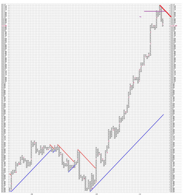
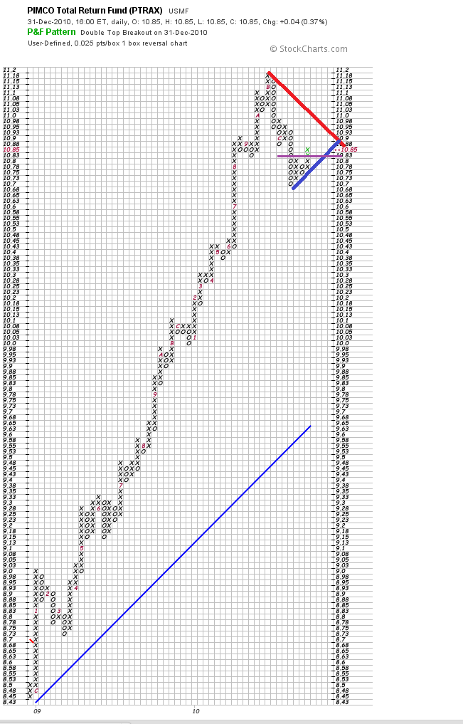
Had a quick look at PTRAX
decided on 1 rev charts of .1 .05 .025
There is more information in the .025
If we find the smallest Box Size
( By moving down in size )
We can then use two degrees larger
Largest for the Primary Trend
The Middle as an Oscillator within the Tend
Smallest to optimize entry
The three sizes will not all move the same
At some point the trend will change ( At the moment DOWN )
and The larger size will be where the MAX information is
and the smaller sizes will be Contained...
Some tools I use are the 45 degree lines ( This is same as counting )
and I think relates to The Constructal Law/Principle:
"For a finite-size (flow) system to persist in time (to live), its configuration must evolve such that it provides easier access to the imposed currents that flow through it."
For a trend to be persist in time , Its rallies and retracements must behave in away that encourages participation ..
Nothing does this better than the action conforming to a 45 degree diagonal..
No one shaken , No one profit taking..
Some tools used on the three scales are measuring the ground gained , ground lost
in relation to the half way points of both columns and phases..
and watching activity the speeding up and down..
On what scale is the action conforming to the 45 degree angle
Does the action on the smaller scale mobile the larger
or does the smaller scale just bounce around mean reverting
etc
So You have Trend and Oscillator .. But at anytime the trend can change its time horizons
as The Population of interest changes in both size and sentiment.
( watch for Volume entering )
Then if there are large Empty spaces
The 3 rev charts for another view
see .05 * .3 rev
This has had a very good run
You would ignore any topping action
at your risk ( Know nothing about it just the chart )
At the very least Profit Taking ?
constructal law ?
Draw a down diagonal from the top on the .025 chart
And Watch
Motorway
-
Choose the scales and reversals that are best suited to the price of the name you are charting and the type of trading you are doing. (“Best suited” is subjective – it is something only you can determine.)If you for example halve a box size.. Do you see at least twice as many reversals ?
In a given phase or period ?
Do you see more ? If so you have a higher information density..
IF not you just have increased Noise ( length ) of columns in relation to information
( the reversals )
Consider the historic chart like a river way below you ( you are in a helicopter )
you take pictures as you draw closer and closer
The picture frame is always the same size
But the amount of information is not
It scales in some way with the change in distance from the river
With a figure chart if you halve the distance ( BOX size )
you always will get columns twice as long
With a chart drawn from the flips of a coin ( random )
You will also get twice the reversals..
But in a non random chart
where there are trading ranges
leading and lagging
Trends etc ( a composite man )
The chart will be patterned with information
at different resolutions ..
In such a way the right BOX size can be quantified
at a particular time and over a particular time horizon
as being the most optimally information dense view of the primary trend
FITB
We can also use log boxes... Very useful for the swing trader wanting to hold for long periods
FITB - Graphical P&F - Charting Tools - StockCharts.com[PA][D20101215][F1!1!9.05!!2!20]&pref=G
The formation starting in Feb 2010
Is 9 columns wide 5 Boxes High
OK halve the BOX size ( these are log boxes )
( you have to think in terms of compound interest that is why it is 9.05 (hint it was half of 18.92 )
what happens ?
width & height ?
and the empty spaces ( this is an important aspect of figure charts ) !
With pts you could start at $2 and work down 1 to .5 to .25 to .125 etc
FITB - Graphical P&F - Charting Tools - StockCharts.com[PA][D20101217][F1!1!2!!2!20]&pref=G
and then there is the changing the reversal to 3 and 5
in order to remove the empty spaces
motorway
-
Wykoff used both 1 box and three Box ( and 5 even 10 ) Box reversal
he used a point when the minimum bid increment was an 1/8
Today prices are decimal so we need ( and can easy with software ) go down to smaller Boxes sizes
A point was only 8 times the minimum bid ( this is what he used for swing/position trading )
( he used 1/8 pt chart for day trading )
So if your instrument is in .01 increments you need to adjust your box size to catch the swings of the CM... Accumulation / Distribution... across certain price levels
You also need to reference different Box size at the same time
Wyckoff did this where in the course he changes from 1 box reversal to 3 box reversal
consider this carefully
the figure chart may show many fluctuations on thefull figures, while the verticals are unchanged. For example, if the high full
figure of a stock on a certain day were 45 and the low 40, there might be sever
al fluctuations back and forth between 42 and 43 on the figure chart, but no indication
of this would appear on the vertical chart.
For these reasons it is vital to keep both forms of charts
what must change in the decimal age, what if your instrument is bid in .0025 pts ?
We can/must alter the box size * something Wyckoff later commented on )
We can also change this quote to
A smaller figure chart may show many fluctuations on thefigures, while a larger one ( box size ) is unchanged. For example,..
......For these reasons it is vital to keep Various resolutions of charts
When a larger Box sizes stops
the activity is unfolding on the smaller scale
But also the smaller scale is contained in the larger..
The figure chart does not lag
At the resolution that you are looking from
A Box always posts in real time
Not artificial Clock time
which distorts volatility
and curvature of the price series
A figure chart is a digital chart
It does not lag it just has a certain resolution
The same as your computer monitor or television
or anything else that is in the digital age ...like the Figure Chart.
Motorway
-
TREND vs TECHNICAL POSTION
THE PROXIMATE DRIVER of ALL TRENDS is CHANGING (THE EXPANSION of) TIME HORIZONS.
Richard D Wyckoff was a true Genius , At an early age He had an experience that like a BOLT OF LIGHTENING illuminated his perception for evermore..
He relates it at least on two occasions . The earliest in a series of articles in the 'TICKER AND INVESTMENT DIGEST .. somewhere around 1907-1909
---To all lines of business YOU MUST buy cheap(er) and sell dear(er) ..Then I remembered how my former employer had got his start. he was a travelling salesman, and in jumping from town to town occasionally ran across concerns which were in financial difficulties. They simply had to have money.
His first opportunity came when a small dealer whose stock of hardware inventoried at $3,000 offered to sell out for $1,500 cash. "The boss" bid him $1,000 , wired east for a loan of that amount, got it, bought out the hardware man, and within a week turned the stock over to another for $1,800.
He bought while the hardware man was in a state of panic
He bought When the TIME HORIZON was almost "YESTERDAY" , When the TECHNICAL POSITION was WEAK . He sold When the TECHNICAL POSITION WAS STRONG and THE TIME HORIZON had become LONG.
The CHANGE OF HANDS, of WEAK to STRONG, -->ALONE, CHANGED EVERYTHING.
THE TECHNICAL POSITION is a STUDY of HISTORY. It is "The markets latent ability to withstand change" . TREND is for the FORECASTER and is "meaningless unless qualified as to TYPE ( TIME HORIZONS ).
It does not mean "the direction prices are NOW moving, but which THEY ARE GOING TO MOVE.
TREND is for the FORECASTER ( John DURAND ) , NOT the HISTORIAN...
---->
It seems to us, based on our experience, that Tape Reading is the defined science of determining from the tape the immediate trend of prices. It is a method of forecasting, from what appears on the tape now in the moment, what is likely to appear in the immediate future. Tape Reading is rapid-fire common sense. Its object is to determine whether stocks are being accumulated or distributed, marked up or down, or whether they are being neglected by the large investors. RDW
It is almost impossible to underestimate the "IMPORTANCE OF THE TECHNICAL POSITION" RDW
Motorway
-
Can you explain what you mean when you say "Technical Position"? Do you mean the quality of the buyers and sellers? (Sorry, I just searched the course and found a good explanation in Section 14M)And you've mentioned "where from" twice now, but I don't understand the reference.
Thanks again
This is why you must read the whole course... over and over again
take this bit
As we have seen from preceding studies, the four principal phases of amarket campaign are: (I) Accumulation, (II) Marking Up, (III) Distribution, and
(IV) Marking Down.
When a stock is in phases (I) or (II) it is said to be in a bullish position
and when in phases (III) or (IV) it is in a bearish position. Or, its behavior may
be such as to indicate that there is no active interest in it, that is, no campaign is
underway or in preparation, in which event its position is neutral. (Sect. 14M,
Pg. 12, Pars. 2 to 5 and Sect. 15M, Pg. 4, Par. 4.)
Our object is to determine the technical position of all of the stocks in our
list, that is, which of the above three positions each may be in, and to just what
degree. (Sect. 18M, Pg. 4, Par. 3.) For this purpose we have to deal with three
basic factors: (1) Price Movement, (2) Volume, and (3) The inter-relationships
between Price Movement and Volume.
Ok Why do we have to determine technical position ?
we areable to judge:
(M) When a move is Beginning and When it is Culminating, thus determining
the best Time to Act.
Ok think of a pendulum swinging ! ( get one and swing it ) at any time the movement determines the future position. But the current position also determines the future movement...
When it swings to an extreme a ( climax... Then this position determines the force and distance of the next swing down !
Ok I hope reference to Olsen is helpful .. If so here is Willain Pascal
In the stock market, you buy a stock because you want to resell it at a higher price. Your feeling about the expensiveness (the value) of the stock is intimately linked to your expectation to sell the stock higher or not. That expectation itself certainly depends on the stock price, but it also depends on other traders' expectations (you'll need to find a buyer).We could say that a trader's expectation at time t of a further price increase is inversely proportional to the Return on Investment (ROI) this trader is running at time t. This means that if you already have a 50% profit, for example, your expectation for a further profit increase is lower now than at the time you bought the stock when you had 0% profit.
I found out that the average ROI of the pool of active traders gives a good representation of the value of a stock as perceived by said traders.
If everyone who holds a stock is sitting on large losses .. This is a certain Technical Position.... Now if they all sell and Now all the new buyers are sitting on small profits
The Technical Position is totally changed....
It would not go up until AFTER they SOLD.
Once they did sell... Not much could stop it from doing so.
Remember the Young RDW and his insight when his then Boss bought the hardware man out...
Motorway
-
don't understand this. How is the conclusion that mots of the open positions are counter-trend? Wouldn't that in effect mean that the trend would HAVE to be reversed by definition?YES... And it is What Wyckoff means ( many occasions in the course ) regarding the quality of supply and demand, of the nature of overbought oversold. Of a Strong Technical Position or a Weak One...
As the trend unfolds the Quality of Demand and Supply alters Olsen==>
speculative positions impact the market twice:first when a trade is opened and then again when the position is closed. This
duality makes it difficult to correctly analyze price movements. To make
things even more complex, there are different groups of speculators, including
short-, medium- and long-term traders, traders based in Europe,
the US and Asia, trend-following and counter-trend traders and many more.
Why prices revertIn liquid financial markets, up to 98% of all the trading is based on speculative
positions and the hedging of those positions. These positions, being
speculative, are temporary, and any opening trade will need to be closed.
The closing trade has the effect of inducing a price reversal. Due to the duality
of the opening and the closing trade, the price movements are never
fully one sided. At some stage, sooner or later, positions will be closed
and then the price rebounds will occur.
Ok What does Wyckoff Say about Waves ?
Every upward or downward swing in the market, whether it amounts tomany points, only a few points, or fractions of a point, consists of numerous buying
and selling waves. These have a certain duration; they run just so long as they
can attract a following. When this following is exhausted for the time being, that
wave comes to an end and a contrary wave sets in. The latter may attract more of
a following than the former.
Waves go up and then they go down... They attract followings ( Olsen says Herding )..
Technical Positions from which trends arise are built from these waves..
As something goes up... The tendency to go down is building and getting stronger.
So moves are interupted with lateral phases... Where the tendency then is to go down..
( This is happening at different scales )
But
After an average or a stock has moved some distance in a given direction,it may encounter sufficient resistance to that particular movement to cause it to
modify its pace, or to rest. During the resting spell (lateral movement or trading range),
the force that was originally operative may be renewed or even
greatly strengthened with the result that the move will be resumed with greater
momentum than before.
This is your
Hrmm.. Without thinking, I would say the tendency after they've been going up.. is to continue going up. The same with going down..But this is what I mean by consider the changing population of interest..It might well have gone down as the "herd" /"Following reversed their positions and new followings arose..
but if the "force is renewed" eg by influx of a large number of new participants .. They will override the existing technical position/consideration..
Much like large waves in the ocean swamp the dynamics of the back and forth ripples.
We judge with Price Volume and Time...
Esp Volume and Time
You can not understand easily one part of the course without understanding the whole.
Some sentences carry a lot of implication.
Never underestimate the importance of the Technical Position ( as RDW tells us )
it is the "Where From"..
In the example prices have been trending down..Supply is overcoming demand.. So when volume increases... Who is turning up ? Sellers ( no we already got them ) it must be Buyers... But of what "quality" ? The Price Range and Duration ( Price & Time ) of the Waves... using here the Vertical Line Chart as a tool to measure..
This interval of nine days marked a sharp acceleration of the previous major decline, culminating in a widening spread of the daily price range and a very marked expansion in the daily volume of trading as the market reached its low pointWe have a big drop, and a huge volume spike. On this last bar, sellers succeeded in pushing the price past the previous days lows, but then buyers overwhelmingly came in to close at the high.There is change of ownership
The new Buyers are not underwater
Many of the holders who were are now not holding..
The Technical Position is changed ( as Olsen would say the ratio of counter trend to trend followers is equalizing.. Note a Counter trend trader in this case is someone who went long at much higher price...Some of the recent buyers are now already in PROFIT )
Always ask yourself WHAT is the TECHNICAL POSITION...
Motorway

Trading The Wyckoff Way
in The Wyckoff Forum
Posted · Edited by motorway
I can not see your charts ?
In the Wyckoff's course there are sections where he moves between the 1 and 3 reversal charts taking note if there are any differences in column widths.
IE: THE SAME !( there is a good hint )
In general you look for the areas of congestion.
You derive upside counts from support ( the Lowest row even if it has more empty spaces )
You derive downside counts from Resistance ( the highest row even if it has more empty spaces )
You can also derive counts from the Line ( row ) with the most filled boxes.
You should scale a chart with the 1 box reversal and then consolidate that chart with the 3 reversal ( then x 3 makes sense because you are consolidating the horizontal and thereby consolidating the buying and selling waves )
If you start with the 3 reversal you will often have a BOX size to small.
The three box reversal is not doing it's job of consolidating the waves on the one box chart.it will tend to just reproduce them.
Again;
IE: THE SAME !Once you have your counts. You must place them in context of the other congestion zones.
Counts that are not fulfilled tell you just as much as having the count as a target.
Counts look forward to what might happen
But they look back and qualify what did happen.
Counts that do not get fulfilled or are quickly negated are telling you something !
A Study - CAUSE and EFFECT - THE COUNT
Motorway